Are high bounce rate and low conversion rate a brand perception problem?
Solve that high bounce rate and increase your conversion rate. Refining every detail to the essentials is how you create both the reality, and the perception, of a luxury or premium business.
When you land on a website try and register if you are subconsciously asking yourself:
Can I trust this business?
Does it feel luxury, premium, or generic?
Is it considered and clear enough for me to hit “Pay now” or “Enquire”?
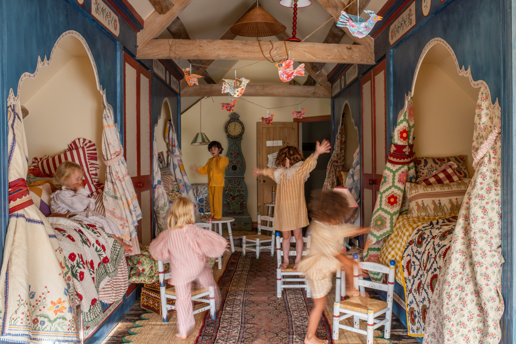
For my folks, high‑end craft businesses like fine jewellers, furniture makers, ceramic artists, mural painters and designers, that snap judgement directly affects whether someone enquires, buys, or quietly nips off to check out a competitor.
Whether we’re creating your website from scratch or redesigning an existing one, a chic‑looking layout on its own is not enough. Every design system choice, photograph, video and line of messaging has to support the perception you actually want to create. Your site isn’t just there to look pretty; it’s there to earn trust, justify your pricing, and express the love, care and years of dedication sitting behind your work.
Below are the five principles I use to design websites that do exactly that.
1. Invest in photography that proves your value, story and product.
Yes it is costly but the ROI is HUGE! Before anyone reads a word, they scan your images and make a pretty swift perception about your brand. For high‑end craft, design, and interiors businesses, photography is not a nice‑to‑have, it is a strong proof of your value and storytelling too.
Detailed, consistent imagery lets people see the quality, materials, textures and finishes behind your work.
Thoughtful art direction, light, composition, styling, backgrounds, quietly signals the level you’re operating at before they ever see your prices.
It tells part of the story. Think about the difference between Pierrot and Sophie Breitmeyers’ photography compared to Graham and Greene or Dunelm, the difference is astounding.
Behind‑the‑scenes photography and video (your studio, tools, process, your hands at work) builds an emotional connection by revealing the time, care and skill that go into each piece.
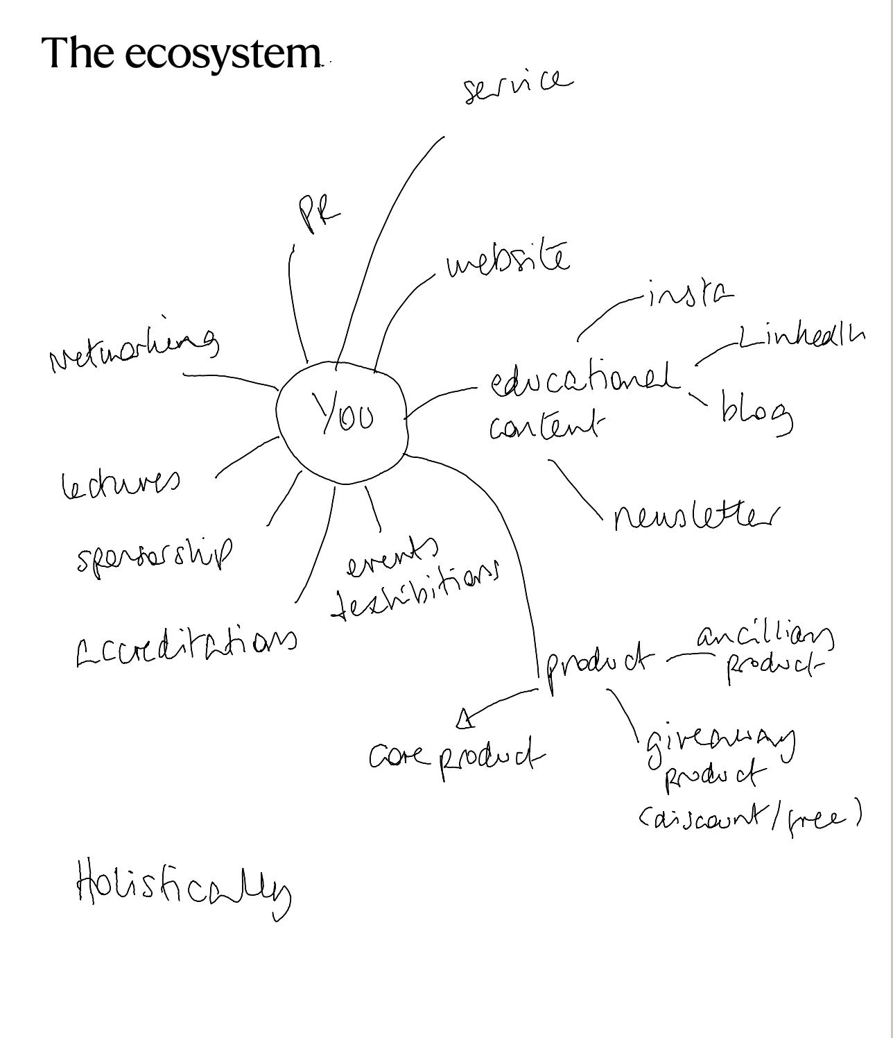
When I design a website, photography is the personality, the integrity, the delicious filling that keeps your storytelling, brand perception sandwich tasty. Strong imagery doesn’t just decorate a page; it is a trust signal that words alone cannot fulfil.One version of a digital ecosystem in its most basic form. Base your RTM strategy on something like this.One version of a digital ecosystem in its most basic form. Base your RTM strategy on something like this.
The ecosystem
One version of a digital ecosystem in its most basic form. Base your RTM strategy on something like this.
2. Route‑to‑market strategy across your whole ecosystem
Most people don’t discover you by typing your URL into a browser; they arrive from Instagram, LinkedIn, Google, a newsletter, or a stockist, and then land on your site. Your website has to act as the hub of that ecosystem, with each route to market clearly considered.
Inbound leads from Instagram need a branded path: a clear link in bio, pinned posts, and story highlights that all point into intentional landing pages (collections, portfolio, enquiries, features).
If you are a service business, LinkedIn is a key route to market, your profile, posts, and featured links should visually and verbally align with your site and send people to strategic pages like services, case studies, or a discovery call.
Your newsletter is another important doorway. Sign‑up forms, welcome sequences, and email templates should feel like a natural extension of your site, not a different brand in someone’s inbox.
When I design, I’m thinking about every doorway into your world and making sure each one feels consistent, intentional, and clearly signposted from first touch to final click. This applies whether we’re building your first website or replacing something that’s never really kept up with how you now work.
3. Functionality that feels effortless
Nothing erodes trust faster than a website that looks beautiful but is confusing or clunky to use. Functionality is not the boring bit, it is a huge part of how “premium” your brand feels.
Clear navigation, intuitive journeys, and simple forms help visitors relax and explore; friction and confusion make them question your professionalism.
Fast loading, mobile optimisation, and logical page structure signal that you are organised, detail‑oriented, and respectful of people’s time.
For e‑commerce, smooth filtering, cart, and checkout flows are essential trust signals that can make the difference between “I’ll leave it for later” and “I’ve just placed the order.”
My aim is functionality that “disappears”, everything simply works, so your client can focus on the work itself rather than wrestling with the website. If we’re starting from scratch, we bake this in from day one; in a redesign, we often fix the quiet frictions that have been putting people off for years.
4. Cohesive brand identity across all touchpoints
Truly premium and luxury brands feel consistent on every platform. Consistency in how you look and sound across your website, social channels, newsletters, and printed collateral is what builds familiarity and trust over time.
Colours, typography, tone of voice, and imagery style should align across touchpoints so that people recognise you instantly, even without seeing your logo.
Your on‑site experience should match what people see on Instagram, LinkedIn, in your emails, and in your packaging or proposals.
This cohesion reduces cognitive load, visitors don’t have to keep “re‑learning” who you are every time they encounter you.
When I’m designing a website, I’m also thinking about how this visual and verbal language will extend into social templates, newsletter layouts, lookbooks, digital guides, and client documents you use every week. That way, you’re not just getting a website; you’re getting a flexible identity system you can actually use.
5. Premium website design that’s both chic and logical
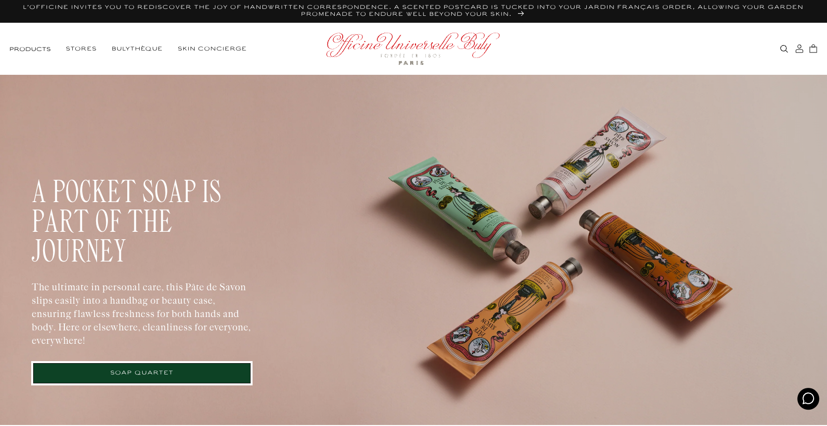
A refined, minimal, or editorial aesthetic used to signal “premium or luxury”, but today heritage is chic (think Officine Universelle Buly, my newest obsession) PLUS the website design must be rooted in logic and customer journey. True premium and luxury online is not just “pretty”; it’s clear, confident, has a personality and easy to understand.
Chic, uncluttered layouts create breathing space for your work and reinforce a sense of calm confidence.
Underneath that, there is a strong content hierarchy: clear headings, considered spacing, and repeated patterns that help people instinctively know where to look next.
Micro‑interactions (hover states, transitions, reveals) are used sparingly to support storytelling, not distract from it.
So when I present designs that feel beautifully minimal or editorial, they’re not just a style choice; they’re a strategic decision to support how you want to be perceived and how you want customers to move through your world. The chicness and the logic are inseparable.
Why this matters before you build or redesign
All of these principles sit under the visuals. If you commission a website, whether it’s your very first site or a full redesign, without clarity on your photography, route‑to‑market, functionality needs, and overall brand identity, you’re asking the design to fix structural problems it can’t solve.
When these foundations are in place from the outset, your website becomes a powerful tool: a premium, coherent experience that reflects the true value of your craft and quietly justifies your pricing every time someone visits. Whether we’re starting from a blank canvas or refining what’s already there, this is the standard I’m designing for.
Are you ready for a redesign or do you need a new website? We offer Migration to Shopify from all the clunky platforms, Webflow Service Websites and supercharged Shopify design & build. I would love to hear from you to chat about your vision, your problems and chat strategy too. Book a call, let’s get you sorted.